It’s no secret that online courses are difficult to manage.
Translating your knowledge into a course is hard enough without adding in the complexities of getting it planned, written, designed, recorded, launched, and marketed. Is your heart starting to race at the thought of this? Yeah, we don’t blame you. But don’t worry - we’ve got some tips to calm you down!
Here are 4 things to avoid while building your online course:
Forgetting to set measurable learning outcomes
We get it. You’re excited for your online course, and you should be! But, you shouldn’t get so excited to share your knowledge that you overload your users with information.
Make sure to set learning goals for each module that are measurable. This blog post discusses the wonderful benefits of setting online learning goals, one of them being that your users can digest what they’re learning along the way. A great way to ensure this is to test out your course content on a few users BEFORE you’ve fully written, recorded, and launched the course.
Making it unbearable to listen to
You might have a great idea for a course, but your voice and presentation might be lacking. If this is the case, consider using voice talent to improve the quality of the sound and engagement. This doesn’t mean you don’t have a great voice, (we’re sure you kill it in the shower) but if you want your course to be successful, be open to the idea of using voice talent.


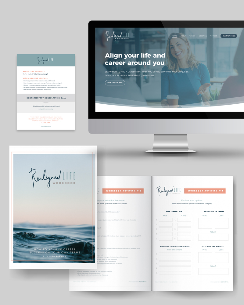
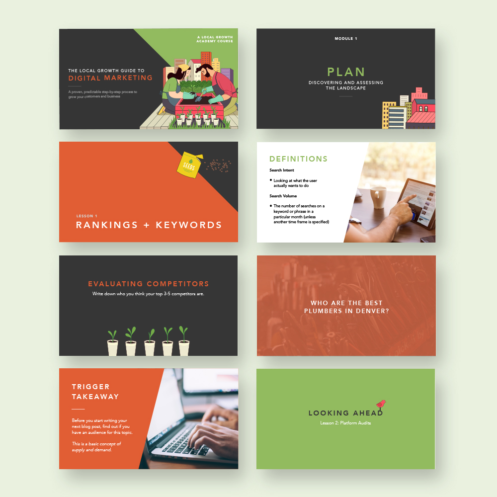
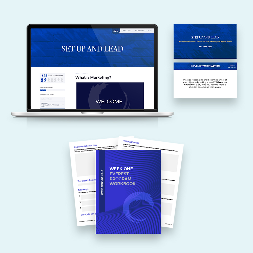
Buying template designs
Did you Google “template design” and see what options came up? If so, no shame. We hate to burst your bubble, but template designs won’t fit your unique course.
You want a custom design that emphasizes all of the aspects that are already great about your course, not one that turns users away. (P.S. - We can help with that! For our full process, visit our online course page.)
Focusing only on design instead of user experience
We obviously think design is great, (we are a design agency, after all) but it’s not the only important thing in an online course. If your course looks great but is difficult for people to use, what’s the point of it looking great?
You want to ensure that your users have a great experience with your online course, which means you have to make it user-friendly. This article from UX Planet does a great job of explaining the importance of user experience design and how it can benefit your business!
We hope these tips help calm your nerves when it comes to your online course.
Luckily for you, we can walk with you through your entire course design process, from Lesson 1 to your closing remarks. Book a Discovery Call today to see how we can help you with your course!
Book A Discovery CallLearn More about Course Design
With more than 10 years of agency experience, Jenny has had the privilege of working with a large variety of brands. She loves partnering with other business owners and entrepreneurs, and specializes in brand development. From digital marketing to online course creation, Jenny’s knowledge and skillset has prepared her to be a successful creative director.


